We're incredibly excited to pull back the curtain on a project we've poured our hearts into: the complete rebrand of the Racine Country Club! This wasn't just about designing a new logo; it was about capturing the essence of a cherished institution and setting the stage for its vibrant future.
Our team at Image Management has been working closely with Racine Country Club over the past year, and it's been an absolute privilege. This significant milestone is the culmination of a truly collaborative effort that brought this vision to life. From web development and web maintenance to comprehensive branding strategies, our expertise allowed us to support RCC every step of the way. See account Executive Paige Wood above after the congratulatory lunch.
Honoring the Past, Embracing the Future
The Racine Country Club recently shared this beautiful message with its members, perfectly articulating the thought and care behind their new brand identity:
Dear Members,
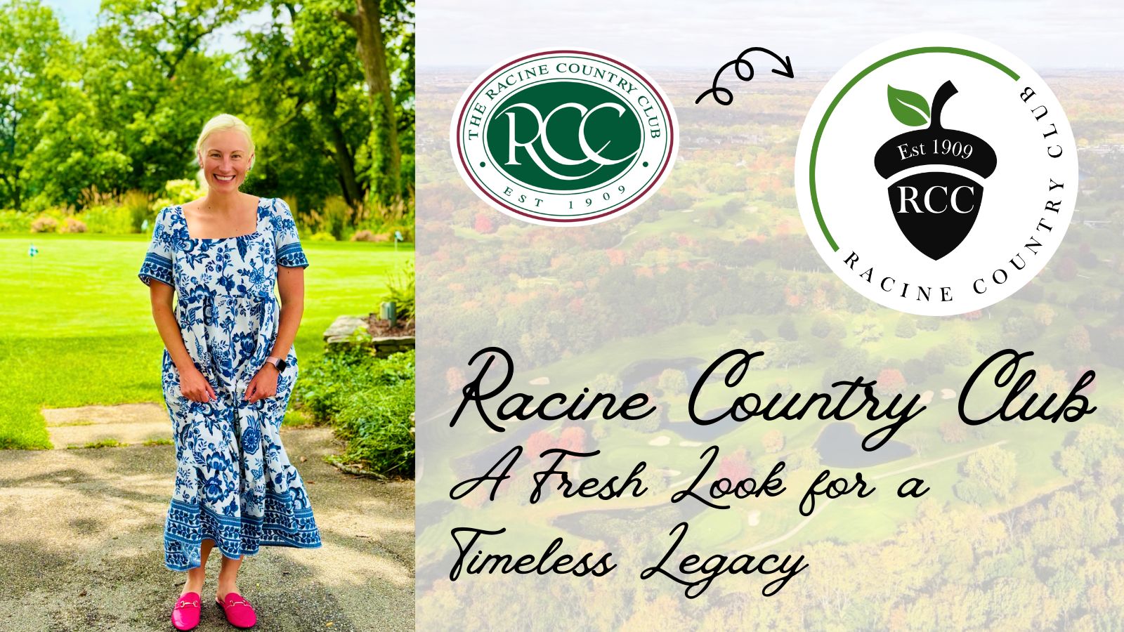
Racine Country Club is unveiling a refreshed logo and brand identity for the Club today – one that honors the past, represents the present, and invites the future.
At the heart of the logo is the acorn, a beloved symbol from RCC’s history and a favorite among Members young and old. Representing strength, growth, and legacy, the acorn reminds us that great things grow from small beginnings. The year 1909 grounds us. The logo reminds us of the Club’s long-standing impact and respected place in Racine’s history. The green color was intentionally chosen to reflect the lush beauty of the 212 acres overlooking the scenic Root River, the vitality of nature, and the fresh energy that the Club is embracing.
Special thanks to Image Management LLC for their creativity, guidance, and patience as they worked with us over the past year on this branding effort.
The new logo will begin appearing throughout the Campus – on signage, menus, apparel, communications, and beyond. It’s a logo we hope you will wear proudly, knowing it represents not only where RCC has been, but where the Club is going. Thank you for being a part of this exciting next chapter in RCC’s story!
From Concept to Creation: Our Comprehensive Approach
It's always rewarding to see a client's vision come to fruition with such clarity and purpose. The Racine Country Club's new logo, with its meaningful acorn symbol, grounding "1909," and vibrant green hues, perfectly encapsulates their rich history and their forward-thinking spirit. Our work, encompassing everything from the initial branding concepts to ongoing digital support, ensures that RCC's new identity is consistently and beautifully represented across all platforms. We're thrilled to have played a part in crafting a brand that members will proudly wear and cherish for years to come.
We’re excited for everyone to see the new logo everywhere, from their beautiful grounds to their member communications. Here's to the next exciting chapter for the Racine Country Club!
Published on July 14, 2025 by Paige Wood