Is your website mobile friendly?
Chances are - it is not. Your current website may show up on a phone or tablet, but do the text and graphics reposition to make it easy to read and simple to navigate?
The correct terminology for a mobile friendly website is responsive design, which means your website will respond optimally on whatever device you view it on.
Google has boosted the ranking of all responsive designed websites as of April 2015, so if you want your site to show up higher on Google, contact Image Management today to make your website responsive!
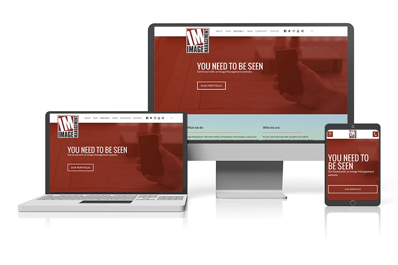
The graphic above shows how the Image Management website responds optimally to different devices such as a desktop, laptop and mobile phone.
Published on May 4, 2016 by Image Management